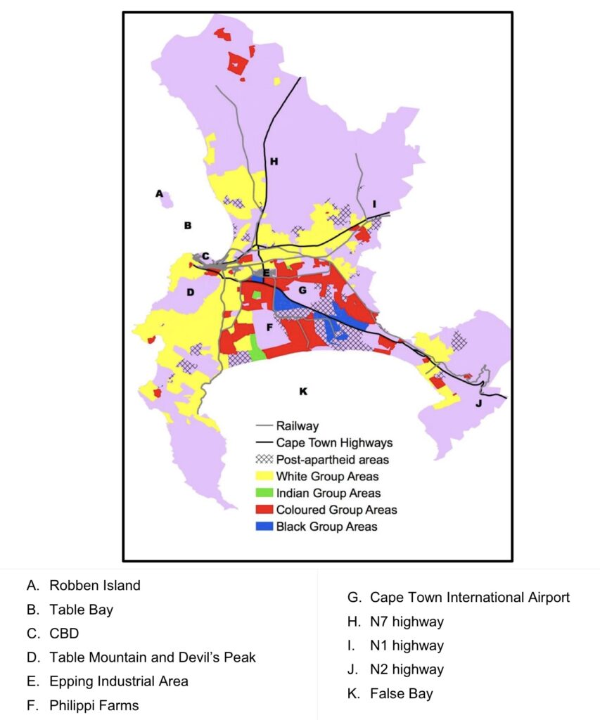
Which beautiful city am I referring to and which hidden scars does it have? I’ll get to that in a moment, but the picture above is a clue…
In a few previous posts (such as this one and this one) I mentioned that, despite having a job that many other might have envied, I chose to leave academia. Initially, I’d considered publishing my PhD as a book, but there are numerous reasons I decided against that idea (at least for now). in any case, a few friends and/or former colleagues suggested that at the very least, I post a few conclusions in my blog in a format that’s easier to digest (than an academic journal article or an entire book). So, that’s what I’m doing…
The city I’m referring to is Cape Town and the scars I’m referring to are only hidden from (some) visitors and ostensibly from residents of well-located leafy suburbs that were previously designate as Whites-only neighbourhoods (see: Group Areas Act and Separate Amenities Act).

On a personal level, I only have one memory of seeing a “Whites only” sign because, at least in Cape Town, they were being removed in the late 1980s already (i.e. even before the aforementioned laws were officially repealed). I was probably about 8-years old, on a day-trip up the west coast and we could use one of the beaches in the town we were passing through.
Although that was more than three decades ago, very little of the apartheid-era racial segregation (as depicted in the map above, produced by Nancy Graham) has been undone. All you need to do is search for Ndifuna Ukwazi (a local NGO) and a something like “inclusive housing” and you will find article, after article, after article and more about the need for this issue to be addressed.

I might have mentioned this before, but my PhD focused on some of these issues and was inspired by my own reflections on living in Cape Town, as well as by the work of organisations like Ndifuna Ukwazi and Abahlali baseMjondolo.
So, why am I writing about this now, especially since I’ve decided to leave South Africa. There are a number of reasons, including the fact that that I’d still like to make a contribution (however small) to the ongoing fight. To be honest, another reason is somewhat selfish – I hope that it aids my current search for remote work so that I can develop a ‘digital nomad‘ life.
I plan on posting a few more entries about this issue, but I thought I’d leave you with one visual from my PhD research.
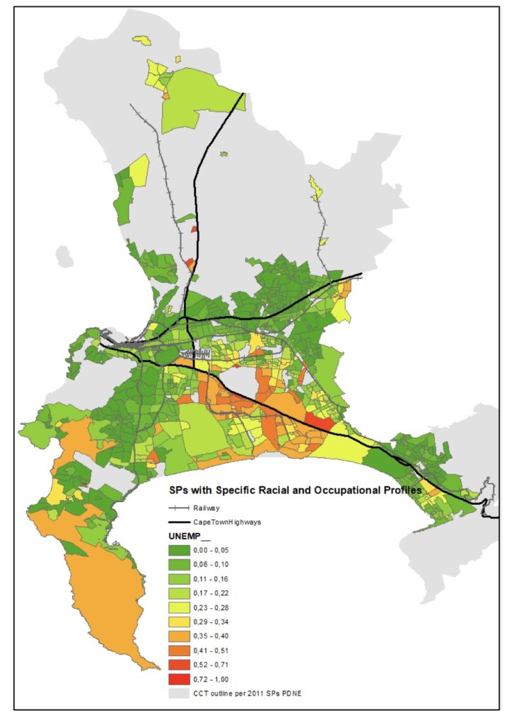
One of the aspects of my research was using ArcGIS to map some of my findings, but this required the kind of detailed data that only a census could provide. The 2011 Census was the most recent at the time and one of the maps I produced was the one on the left above which shows the unemployment rate by sub-place in 2011.
You don’t have to be specialist or an academic to see that the most of the areas with the highest unemployment rates (i.e. the orange and red) are those that correspond with apartheid-era Coloured and Black African group areas. This is also a major reason that (un)employment is often at the heart of the calls for undoing spatial apartheid.

